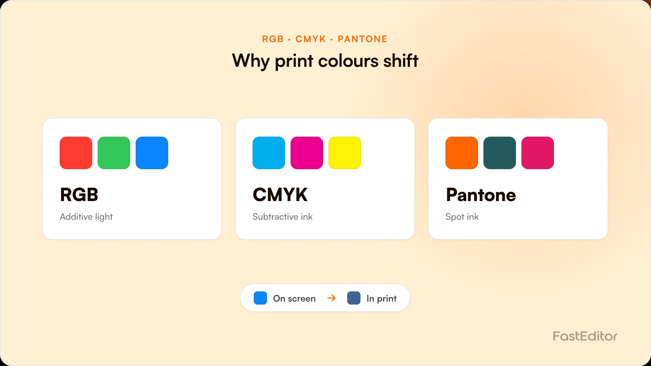
Colours shift between RGB, CMYK and Pantone because each system has a different gamut, so every conversion approximates. RGB to CMYK dulls bright colours, while converting CMYK to RGB can destroy exact print data. A colour-aware pipeline preserves the original values, matches brand colours to spot inks, and proofs in the destination space.
A customer signs off on a vivid blue logo on screen. A week later the mugs arrive in a flatter, greyer blue, and the complaint lands on your desk. Nothing was printed incorrectly. The colour simply moved between three systems that describe colour in incompatible ways: RGB on the screen, CMYK on most digital presses, and Pantone spot inks on the print bench. For anyone selling decorated products, colour drift is not an occasional accident. It is the default behaviour of the pipeline unless something manages it on purpose.
On this page
This guide explains why colours shift between RGB, CMYK and Pantone, which conversions are safe to automate and which are not, and how an artwork automation platform like FastEditor preserves colour intent from the moment a logo is uploaded to the final production file. The aim is practical: fewer reprints, fewer approval arguments, and a proof your customer can actually trust.
Each system exists for a different medium, and each can express colours the others cannot.
| Property | RGB | CMYK | Pantone (spot) |
|---|---|---|---|
| Used for | Screens and web previews | Digital and offset full-colour print | Solid spot-ink printing |
| Colour model | Additive light (red, green, blue) | Subtractive ink (cyan, magenta, yellow, black) | Pre-mixed named inks |
| Gamut | Wide, includes bright, glowing colours | Narrower, cannot reach the brightest RGB values | Exact, but one colour per ink |
| Best at | Vibrant on-screen display | Photographic and multi-colour artwork | Brand-critical, repeatable single colours |
| Typical file | PNG or JPEG website logo | Print-ready PDF or EPS | Vector with a named Pantone swatch |
Because the three gamuts do not overlap perfectly, moving a colour from one to another means approximating it. That approximation is where drift is born. Vector and raster files also carry colour definitions differently, which is worth understanding alongside the difference between vector and raster files.
Screens create colour by adding light, so red, green and blue at full strength make white. Ink does the opposite: it subtracts light from white paper, so cyan, magenta, yellow and black combine towards dark. An additive system will always be able to display colours that a subtractive system cannot physically mix. That single fact drives most of the surprises.
The most familiar shift happens when a bright RGB design is sent to a CMYK press. Electric blues, neon greens and vivid oranges sit outside the CMYK gamut, so they are pulled back to the nearest printable value and look duller than they did on screen. This is not a fault in the press or the file. It is the physical limit of ink. The fix is to design and proof in the destination space, so the customer approves what the press can actually produce, not a brighter version it never could.
A less obvious failure runs the other way, and it is the one that catches production teams out. When a correct print-ready CMYK file, sometimes carrying a named spot colour inside it, is flattened into RGB to be shown on screen or saved as a web asset, the exact CMYK ink recipe can be discarded and replaced with a screen approximation. The file still looks fine on the monitor, so nobody notices, but the precise values the press needed are gone. If that RGB file then becomes the artwork of record, the colour is permanently off. A colour-aware pipeline never does this. It keeps the original CMYK and spot values untouched as the source, and generates an RGB copy only for preview.
A Pantone spot colour is a pre-mixed ink with a fixed recipe, so it prints the same on every run regardless of the press. That is why brand guidelines specify Pantone numbers for logos. The catch is that a spot colour has no exact RGB or CMYK twin, so any on-screen or full-colour rendering of it is an approximation. This is precisely why automated PMS colour matching matters: the system maps artwork to the correct spot ink for single and two-colour decoration, and keeps that mapping attached to the file rather than guessing again at each stage.
Automation is not the enemy of colour accuracy. Uncontrolled conversion is. The distinction is what to convert, when, and whether the original survives.
Handling colour correctly is not one feature, it is a discipline applied at every stage from upload to output.
Colour separation is also part of automated vectorization, where a traced logo is split into discrete fills and matched to spot equivalents, and it feeds directly into print proof creation. Which colour space a job should live in depends on the decoration technique, so the two decisions cannot be separated.
Screens use additive RGB light and can display brighter colours than ink can mix. Printing uses subtractive CMYK or spot inks with a narrower gamut, so vivid on-screen colours are pulled back to the nearest printable value and can look duller. Proofing in the destination colour space prevents the surprise.
It depends on the decoration method. Pantone spot inks give exact, repeatable single colours and are best for brand-critical logos in one or two colours. CMYK is best for photographic or multi-colour artwork. Many jobs use both: spot for the logo, CMYK for full-colour elements.
Use a defined colour profile rather than a one-click default, convert once at the right stage, and always preview the converted result before approval. Keep the original file so nothing is lost, and accept that the brightest RGB colours cannot be reproduced in CMYK.
A well-built pipeline preserves your original CMYK and spot values and only creates RGB versions for preview. Problems arise when a system overwrites the source with an on-screen approximation, so the key question to ask any tool is whether it keeps the original print data intact.
More articles in Artwork Automation.
