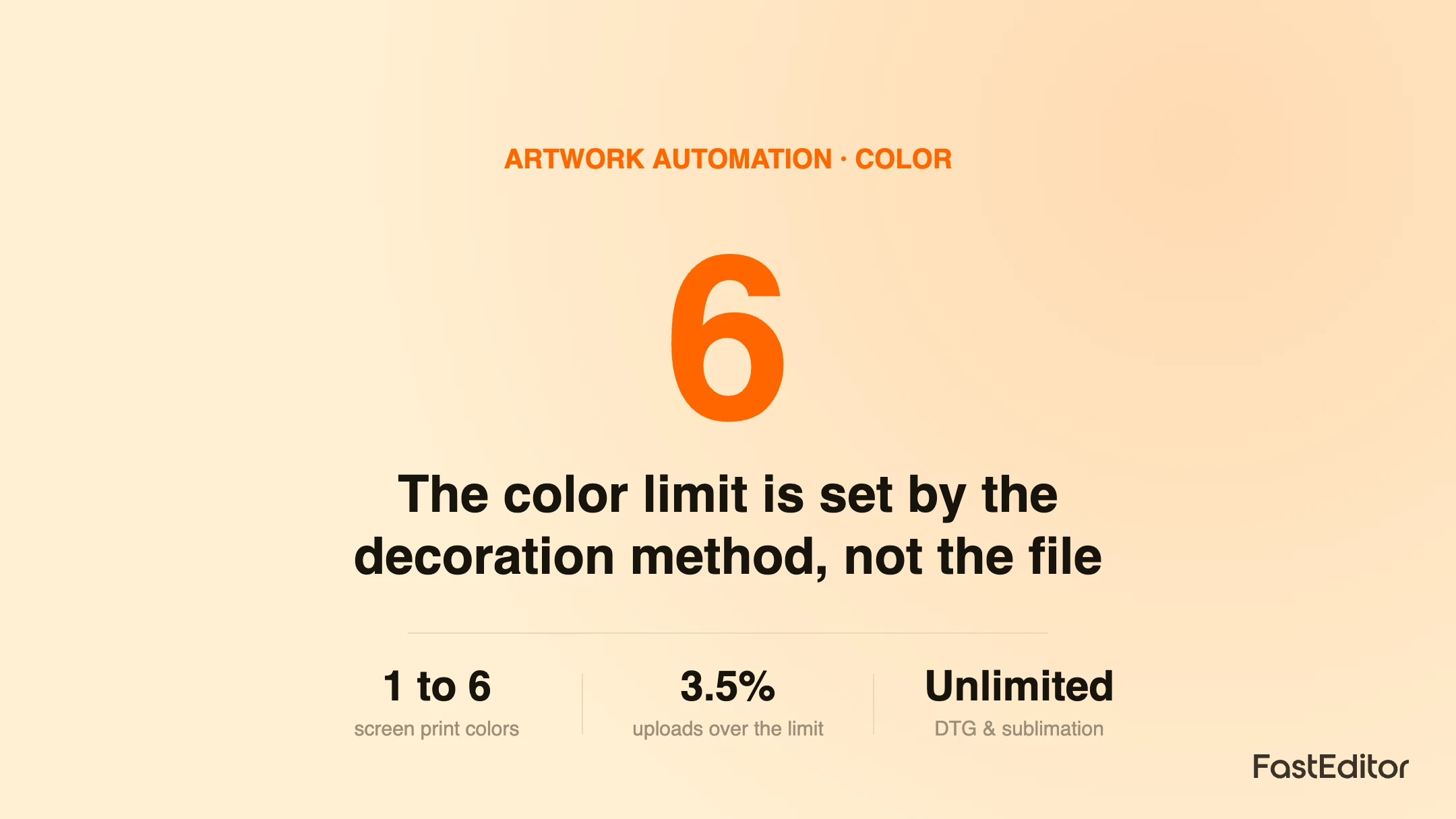
Color limits come from the decoration method: spot methods like screen and pad print allow only a handful of colors, while digital methods like DTG and sublimation are effectively unlimited. Logos exceed limits because anti-aliasing, shadows and gradients add colors the eye misses. Automated color quantization, spot matching and reduction presets bring a file inside the limit in seconds.
A customer uploads what looks like a clean three color logo. Your screen printer opens it and sees forty. The drop shadow, the soft edges and a faint gradient in the badge have each added colors the eye never registered, and now the file is over the limit for the print method. This is one of the most common reasons a logo gets flagged before production, and it is almost always a surprise to the person who uploaded it.
This guide explains how color limits actually work across decoration methods, why logos exceed them, and how automated artwork handling brings a file back inside the limit without a designer. It is written for promo and print businesses deciding how many colors to allow, and how to handle the files that arrive with too many. For the wider picture, see how this fits into artwork automation on FastEditor.
On this page
Color limits are not an arbitrary rule. They come directly from the physics and economics of each decoration method. In spot color methods, every color is applied separately, so each one adds a screen, a plate, a setup step or a pass. Two colors cost and take more than one, and six colors is a different job entirely. In full color methods, all colors are built at once from a fixed set of process channels, so the count stops mattering but exact brand matching gets harder. Understanding which camp a method sits in tells you almost everything about how many colors you can offer.
The table below is a working guide. Treat the numbers as typical rather than absolute, because the real limit for any product comes from the supplier's spec, which good systems store per product.
| Method | Color model | Typical color limit | Why |
|---|---|---|---|
| Screen print | Spot colors | Around 1 to 6 | One screen per color; each adds setup and cost |
| Pad print | Spot colors | Around 1 to 4 | One pad and plate per color |
| Embroidery | Thread colors | Limited palette | Each color is a separate thread and stitch sequence |
| Laser engraving | Single tone | 1 (tonal) | The mark is the material, not ink |
| DTG and DTF | Full color (process) | Effectively unlimited | All colors printed together from process inks |
| Dye sublimation | Full color (process) | Effectively unlimited | Dye diffuses across the whole surface at once |
The practical takeaway is that the same logo can be perfectly fine on a sublimated mug and flagged on a screen printed shirt. The file did not change; the method did. This is why color rules belong to the product and decoration method, not to the upload, and why the check has to run at the moment a customer chooses what they are ordering. The mechanics of matching those spot colors are covered in PMS color matching for promo products, and the wider color space question in RGB vs CMYK vs Pantone.
Here is the part that trips up customers and salespeople alike. A digital image counts colors literally, and several everyday features inflate that count far beyond what a person sees:
The benchmark view
Across 13,773 logo uploads analysed in the FastEditor Artwork Automation Benchmark 2026, about 85 percent needed at least one automated fix before production, and 3.5 percent exceeded the color limit for the chosen print method. Color is rarely the only issue on a file, which is why it is handled alongside vectorization and background removal rather than on its own.
Because the excess colors are usually an artifact of how the file was saved rather than a real design choice, they can almost always be removed automatically without changing how the logo looks. That is the job of color reduction.
Automated artwork handling closes the gap between what the customer uploads and what the method can print, in three steps that run in seconds.
First, automated vectorization and color quantization collapse the thousands of near-identical pixels into a small set of dominant colors. Anti-aliased halos and compression noise fold back into their parent shapes, so the measured count drops to the handful of colors the design actually uses. Second, each remaining color is matched to its nearest spot color equivalent, so brand colors survive the reduction. Third, when the count is still over the limit, the system reduces further using presets, bringing a six color logo to three or two, and shows the customer a faithful preview of the result rather than a flattering mockup. The clean, color correct file then flows into production-ready file generation and an instant print proof.
The difference between a usable system and a frustrating one is the preview. Customers accept a reduced palette when they can see it looks right, and object when a color is dropped silently. A good editor makes the reduction visible and offers a choice of presets when the default combination does not suit the brand.
If you run an editor for your customers, three decisions keep color problems from reaching production:
Handled this way, the color limit stops being a rejection reason and becomes an invisible step. Related decoration constraints such as minimum line thickness work the same way, and are covered in decoration techniques explained. You can see color reduction running on your own files in a Studio demo.
It depends entirely on the decoration method. Screen print and pad print use spot colors and are usually limited to a handful, often one to six, because each color is a separate screen or pass. Embroidery is limited to a thread palette. Digital methods such as DTG, DTF and dye sublimation reproduce full color, so the practical color count is effectively unlimited. The supplier's product spec sets the exact limit.
The editor compares the number of distinct colors in your uploaded logo against the color limit for the chosen decoration method and product. Anti-aliased edges, drop shadows and gradients quietly add dozens of colors that the eye reads as one, so a logo that looks like three colors can measure as forty. When that count is over the limit, the file is flagged so it can be reduced before production.
Spot color printing lays down one solid ink per color, each matched to a reference such as a Pantone value, which is why it is limited and why it reproduces brand colors precisely. Full color printing builds every shade from a small set of process inks or channels, so it handles photographs and gradients but matches specific brand colors less exactly.
Yes. Color quantization groups the thousands of near-identical pixels in an upload into a small set of dominant colors, then maps each to its nearest spot color. Good systems offer presets so a six color logo can be brought to three or two colors without the customer editing anything by hand, and show a faithful preview of the reduced result.
More articles in Artwork Automation.
