A soft proof is an on-screen preview; the final print is ink on a physical surface. They differ because screens emit RGB light while presses use CMYK and spot inks, substrates shift colour, and placement is set by the product's real decoration area. Accurate proofing locks colour, size, method, and position to production rules.
The core mismatch: your screen mixes light (RGB), a press lays down ink (CMYK plus spot colours), and the two colour spaces do not fully overlap. A colour that glows on a monitor can be physically out of reach in ink. Accurate proofing is about closing that gap on purpose, not hiding it.
The logo looks perfect on screen. The reseller approves it, the order goes to production, and the printed product comes back a shade too dark, or the imprint sits a few millimetres off the spot everyone signed off on. A soft proof is an on-screen preview of how artwork will print, and in this case nobody made an obvious mistake. This gap between the on-screen proof and the final print is one of the most common causes of reprints in promotional and web-to-print production. The good news is that it is predictable. Once you understand the handful of reasons a soft proof and a printed product disagree, you can make your proofs production-accurate. At FastEditor we treat the proof as a contract: what the customer approves should be exactly what production receives.
A soft proof is an on-screen preview, a digital PDF or an interactive 3D view, that shows layout, placement, size, and an approximation of colour. A hard proof is a physical sample printed to check colour and feel before a full run. The final print is ink, thread, or toner on a real material. Each step loses a little fidelity to the next, and knowing where the loss happens is how you stop it from costing you reprints.
| Soft proof | Hard proof | |
|---|---|---|
| What it is | On-screen digital preview, PDF or 3D | Physical printed sample |
| Best for checking | Layout, placement, size, content, method | Exact colour and material feel |
| Speed | Seconds, online | Days, shipped |
| Use when | Most promotional orders | Colour-critical jobs |
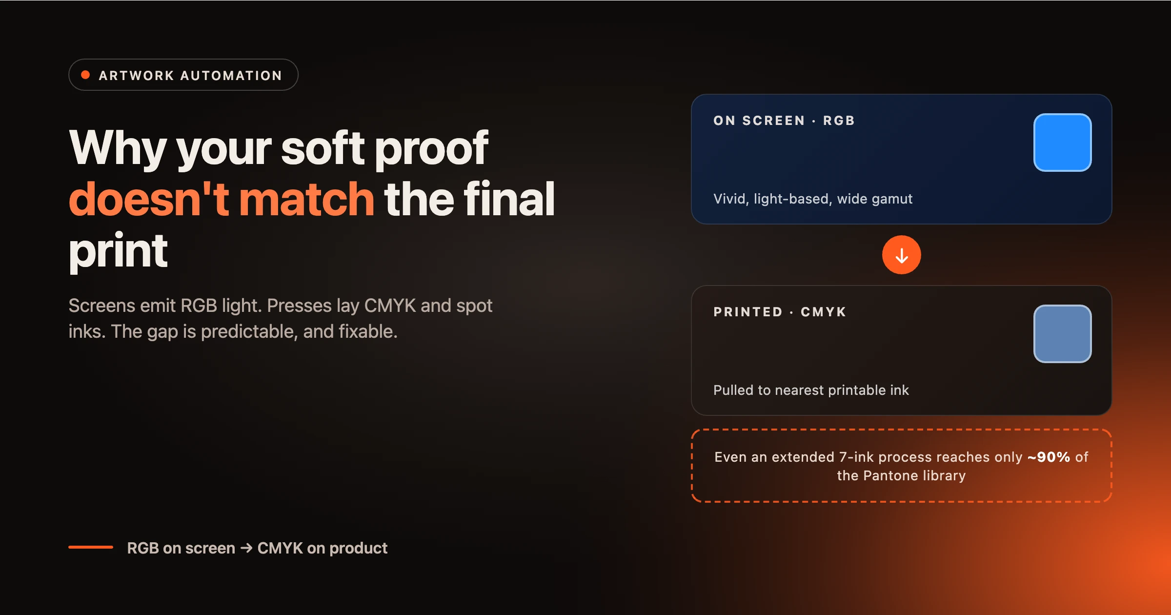
Monitors build colour by mixing red, green, and blue light (RGB). Presses build colour by layering cyan, magenta, yellow, and black ink (CMYK), sometimes with spot inks. The RGB range a screen can show is larger than the CMYK range most presses can print, so the brightest on-screen blues, greens, and oranges simply have no ink equivalent. Pantone notes that even an extended seven-ink process, CMYK plus orange, green, and violet, reaches only around 90% of its spot colour library. When a vivid RGB value is converted for print, it is pulled to the nearest printable colour, and that shift is what you see on the finished product.
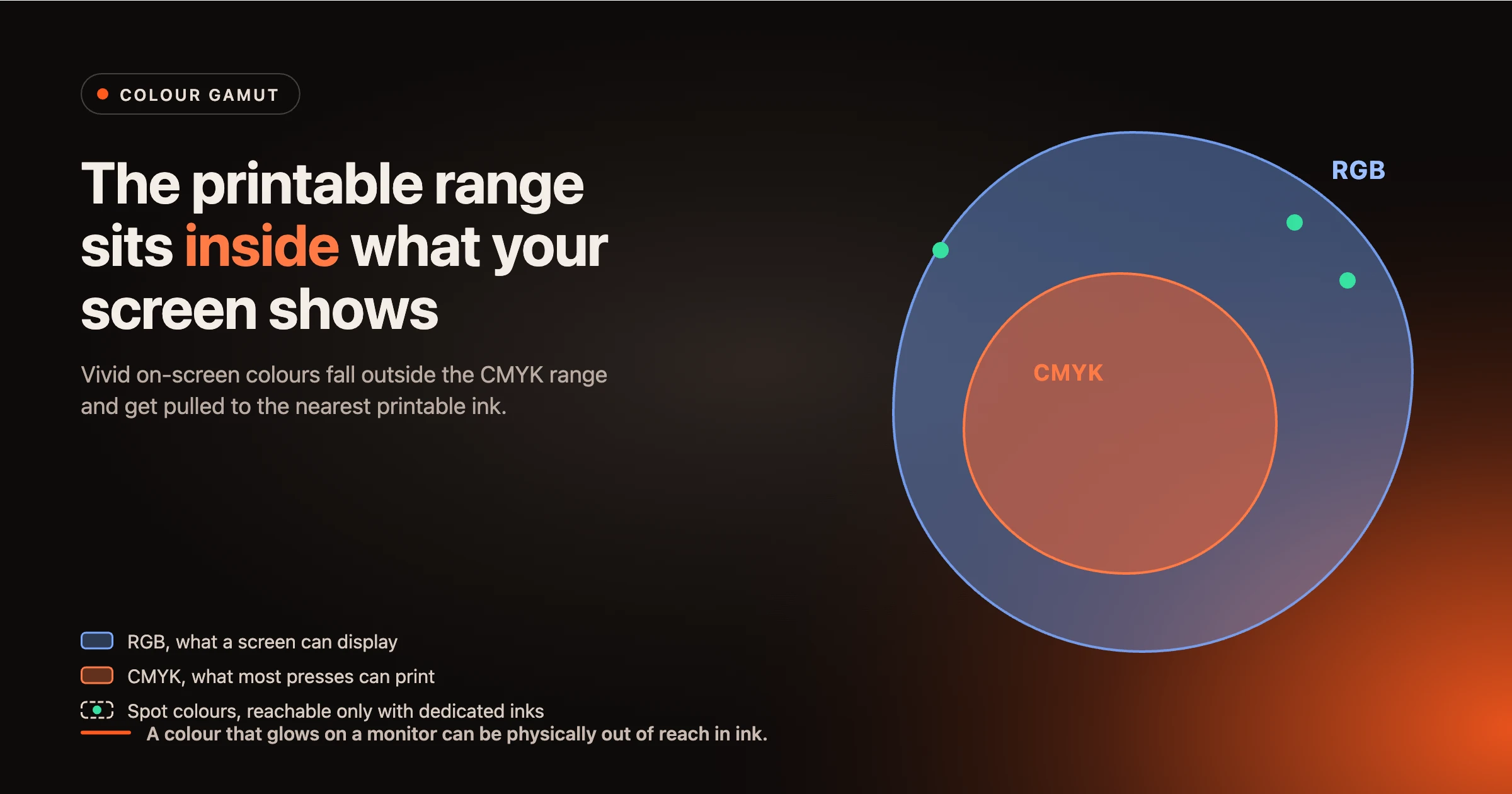
A Pantone (PMS) colour is an abstract, standardised colour, not a fixed mix of pixels or ink. It has approximate RGB and CMYK representations, but a monitor can only ever show an approximation of it. This is why a brand colour locked as a PMS value is the most reliable way to carry colour from screen to product: the spot ink reproduces the definition directly, instead of relying on a screen-to-CMYK guess. We go deeper on this in PMS colour matching for promo.
The same ink looks different on a glossy tote, a matte mug, and a coloured polo. Substrate colour, texture, and finish all shift the result, and an uncoated surface absorbs ink differently from a coated one, which is exactly why Pantone publishes separate coated and uncoated guides. A flat on-screen render cannot fully simulate how a decoration method behaves on a specific material, so a degree of variation is normal and should be expected rather than treated as a defect.
Two uncalibrated monitors rarely agree, and neither matches a print viewed under shop lighting. Professional soft proofing assumes a calibrated display and a standard light source, commonly D50, paired with the correct ICC profile, so that everyone is judging colour against the same reference. Without that, the proof your customer approves on a phone in a cafe is not the proof your production team is looking at.
When a wide RGB design is converted into a narrower print space, the software has to decide what to do with colours that fall outside the printable range. That decision is the rendering intent: a perceptual intent shifts the whole image to keep colour relationships natural, while a relative colorimetric intent keeps in-range colours exact and clips the rest. Neither is wrong, but they produce different results, which is one more reason the same file can print two ways. The industry measures colour difference as Delta E, and the practical takeaway is simple: agree an acceptable tolerance with your supplier up front rather than expecting a perfect match.
How close the print lands to the on-screen colour depends heavily on the decoration method, because each method uses a different colour system.
| Method | Colour system | Closeness to screen | Note |
|---|---|---|---|
| Screen and pad print | Spot inks mixed to PMS | High for brand colours | Best route for an exact brand colour |
| Embroidery | Thread library, not ink | Approximate | Colour is matched to the nearest thread shade |
| Digital print, DTG and UV | CMYK, sometimes plus white | Medium | Vivid RGB values shift like any CMYK conversion |
| Dye sublimation | CMYK dyes into the material | Medium | Substrate colour strongly affects the result |
This is why a proof should always state the method. The decoration method is not a cosmetic label, it sets which colours are even achievable.
Colour gets the attention, but the most expensive proofing errors are often about position and size. A logo can look perfectly placed in a preview while sitting outside the real decoration area on the product. If the dotted boundary in the editor does not match the actual imprint zone the supplier can decorate, the customer approves something that cannot be produced as shown, and the order stalls or comes back wrong. An accurate proof draws the decoration area from the product's real specification, scales the artwork within the imprint limits in millimetres, and validates it against the rules of the chosen decoration method. That is the difference between a render and a proof: a proof respects what the machine can physically do.
A trustworthy proof is not the prettiest picture, it is the one that matches production. Here is what separates a marketing render from a production-accurate proof.
| Factor | Why the screen misleads | What an accurate proof does |
|---|---|---|
| Colour | RGB light is wider than CMYK ink, so vivid values shift on conversion | Locks a PMS value per decoration method instead of a screen colour |
| Spot colours | A monitor only approximates a Pantone definition | Carries the PMS reference through to the production file |
| Material | A flat render ignores substrate and finish | States the method and adds a substrate and on-screen colour disclaimer |
| Placement | Artwork can sit outside the real imprint area | Snaps to the product's decoration area at true size in millimetres |
| Size | On-screen scale is arbitrary | Validates artwork against the method's imprint limits |
Before you send a proof for approval, confirm it does all of the following. A preflight step like this is what separates a render from a proof.
Sample colour disclaimer: Colours shown on screen are an approximation. Final printed colours may vary with decoration method, material, and viewing conditions. Where an exact brand colour is required, please supply a Pantone (PMS) reference.
The reliable way to make a soft proof match the final print is to generate both from the same engine. When the proof and the production-ready file come from one source, through automated production-ready file generation, there is no second interpretation step where errors slip back in: what the customer approves is the instruction production receives. In the Product Hub, products carry their decoration areas, methods, and imprint limits as data, so print proof creation places artwork inside the real print area, locks colour per method, and prints the dimensions and a disclaimer on the proof itself. Reviewing it in 3D visualisation adds a sense of the material and wrap that a flat mockup misses. None of this removes colour science, it just stops the proof from promising something the press cannot keep. You can see the fast version of this in building a print proof in about 30 seconds.
If reprints and approval back-and-forth are eating your margin, the fix is a proof your customers can trust. Try the Studio Tool and build a proof against a real product catalogue to see how placement, size, and colour are locked to production rules.
Screens emit red, green, and blue light, while presses use cyan, magenta, yellow, black, and spot inks. The on-screen RGB range is wider than printable CMYK, so vivid colours shift when converted, and the material and lighting move the result further. Locking a PMS value per method is the most reliable way to control it.
A soft proof is an on-screen digital preview for checking layout, placement, size, and method. A hard proof is a physical printed sample for confirming colour and feel. Soft proofs suit most promotional orders, while hard proofs are for colour-critical jobs.
No. A monitor can only approximate a Pantone (PMS) colour, because a spot colour is a standardised definition rather than a screen value. Treat the on-screen swatch as a guide and rely on the named PMS reference for the exact colour.
Screens emit light, so colours look luminous, while a printed product reflects light and sits within a narrower ink gamut. Vivid on-screen colours are pulled to the nearest printable colour, which usually reads as slightly darker or less saturated on the product.
No. A monitor can only approximate ink colour, and substrates and lighting vary, so some variation is expected. An accurate proof manages that gap with locked PMS values, a stated method, and a clear disclaimer, rather than pretending the gap does not exist.
Use a proof that draws the decoration area from the product's real specification and scales artwork within the imprint limits in millimetres, so the boundary shown in the proof matches what the supplier can actually decorate.