Some logos cannot be auto-vectorized because tracing needs flat color regions with clean edges, and photographs, gradients, tiny text and files built from many embedded images remove that structure. The fix is usually the source file: supply the original vector, or a large flat high-contrast raster, and reduce colors to what the print method supports. Good systems detect these cases and route genuine failures to human review.
Most everyday logos convert to clean vectors in seconds. Then a file arrives that defeats the tracer: a photographic crest, a gradient that turns to stripes, a wordmark so small the letters are four pixels tall, or a PDF stuffed with dozens of embedded images. These are the hard cases, and how a system handles them is the real test of an artwork pipeline. This guide explains why these inputs break automated tracing and exactly how to fix each one.
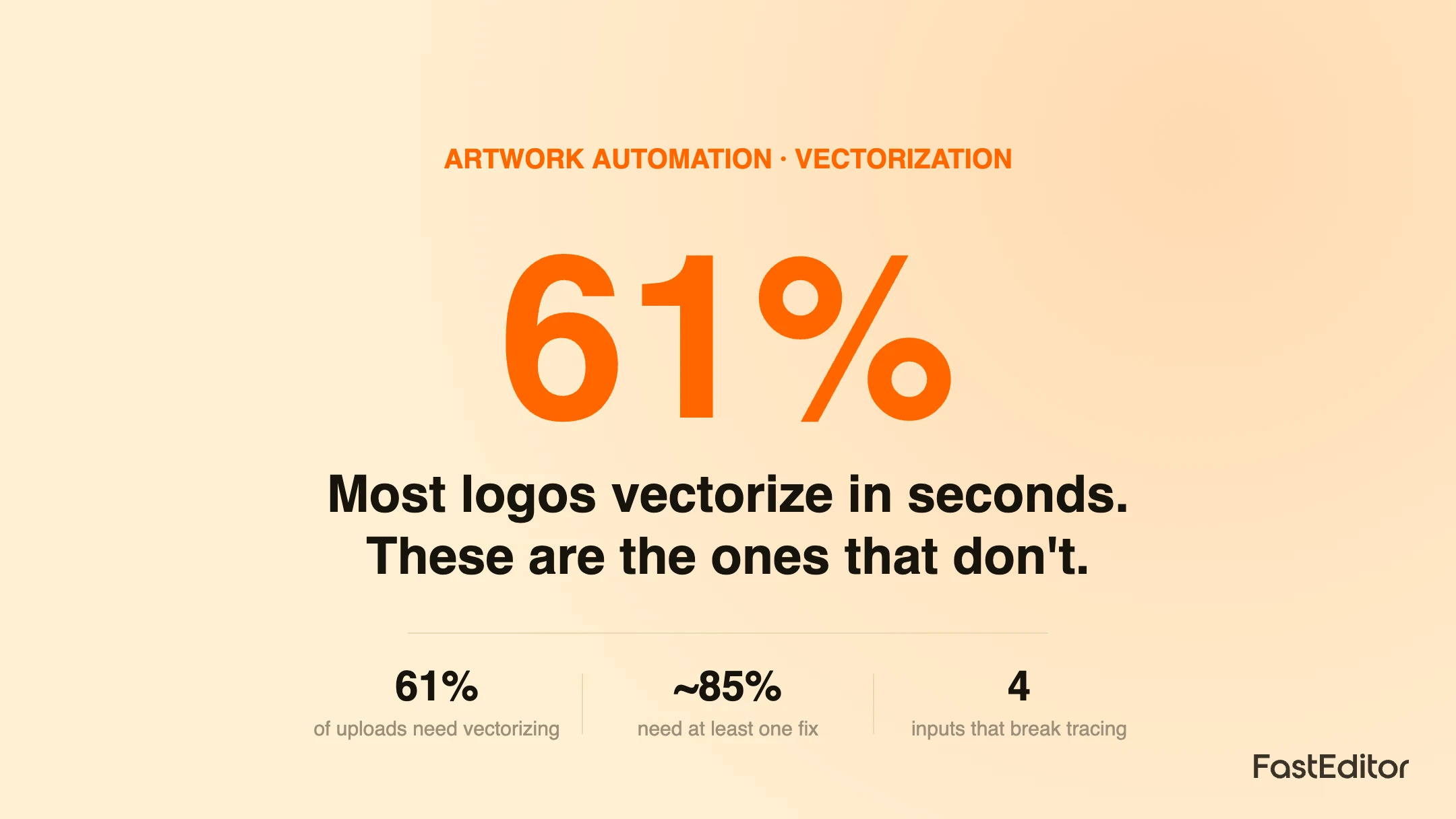
The scale is not small. Across the FastEditor Artwork Automation Benchmark 2026, 61 percent of 13,773 logo uploads needed vectorization before they could be produced, and roughly 85 percent needed at least one automated fix. Most convert cleanly. This article is about the ones that do not, and why that is usually the file, not the tool. It builds on the mechanics in how automated vectorization works; here we go deep on the failure modes. The wider system is FastEditor.
On this page
Vectorization converts a grid of pixels into editable paths by finding the boundaries between areas of flat color and fitting curves to them. That one sentence explains every failure that follows. Tracing needs discrete regions of color with clear edges. Anything that removes that structure, continuous tone, blur, noise, or detail finer than the pixels can hold, leaves the engine guessing. When it guesses, you get spikes on rounded shapes, mush where there was sharp type, or an abstract blob where there was a photo.
Four input types cause the large majority of failures. The table names each, what goes wrong, and the fix that follows in the next section.
| Input | Why it breaks tracing | Fix |
|---|---|---|
| Small or low resolution text | Letters occupy too few pixels; edges are rough and detail is missing | Upscale first, or substitute the closest font, then vectorize |
| Gradients and shading | Continuous tone becomes banded stripes; there are no flat regions to trace | Preserve as a defined vector fill, or reduce to flat colors |
| Photographs and photorealistic marks | No shapes to trace; every pixel differs from its neighbor | Route to a full color raster method, do not trace |
| Files with many embedded images | A PDF or SVG built from dozens of raster pieces has no single clean graphic | Supply one flat image or a true vector rebuild |
Two of these deserve extra attention because they are the ones customers least expect. Text is a problem not because letters are hard to trace, but because a raster upload has thrown away the font. The engine sees shapes, not characters, so it either traces the shapes as they are, rough edges included, or recognises the letters and rebuilds them in the closest available typeface. Gradients are a problem because the print method often cannot reproduce them anyway; a two color screen print has no way to render a smooth fade, so the honest answer is to flag it for simplification rather than trace a striped mess.
Almost every failed conversion has a clear remedy, and most start before the file is ever uploaded.
When the print method limits colors, simplification often means color reduction too, which is covered in how many colors you can actually print. A high contrast, flat, high resolution version of a logo will trace cleanly where the original JPEG failed. Practical repair strategies for the worst uploads are in fixing low quality customer logos.
The gap between a toy and a production tool is entirely in how it behaves when a file is hard. A production system does four things at the edge cases:
That last point matters most. The goal is not to trace everything, it is to trace the large majority automatically and to fail loudly and helpfully on the rest, so nothing broken reaches the printer. What the finished file must contain either way is defined in what is a production-ready file. You can test your own hardest files against the pipeline in a Studio demo.
Tracing turns areas of flat color into shapes. Inputs that have no clean shapes to trace, such as photographs, heavy gradients, tiny text or files built from many embedded images, give the engine nothing reliable to convert. Good systems detect these cases, score their own confidence, and route genuine failures to a human instead of producing a broken result.
Start with the source. Ask for the original vector file, an SVG, EPS, AI or PDF made of shapes rather than photos. If only a raster exists, supply the largest and cleanest version, reduce it to a few flat colors, remove photographic backgrounds, and avoid gradients where the print method cannot reproduce them. A simplified, high-contrast version traces far better than a small JPEG.
Yes, but text is a special case. If the font is not embedded, the engine cannot know the exact typeface, so it either traces the letter shapes directly or substitutes the closest matching font and then vectorizes. Tracing very small or low resolution text produces rough edges, so production systems upscale first and warn when text will be too small to print cleanly.
A vector file is always best, ideally an SVG, EPS, AI or PDF exported from the original design. When only a raster is available, a large PNG with a transparent background and flat colors is the next best thing. The worst inputs are small JPEGs pulled from a website or email signature, because compression and low resolution destroy the clean edges tracing needs.
More articles in Artwork Automation.
