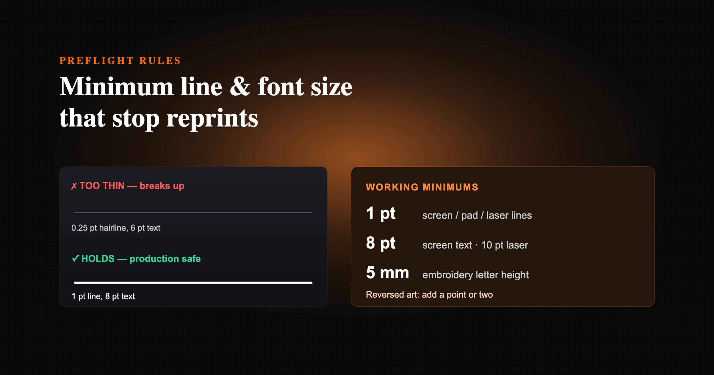
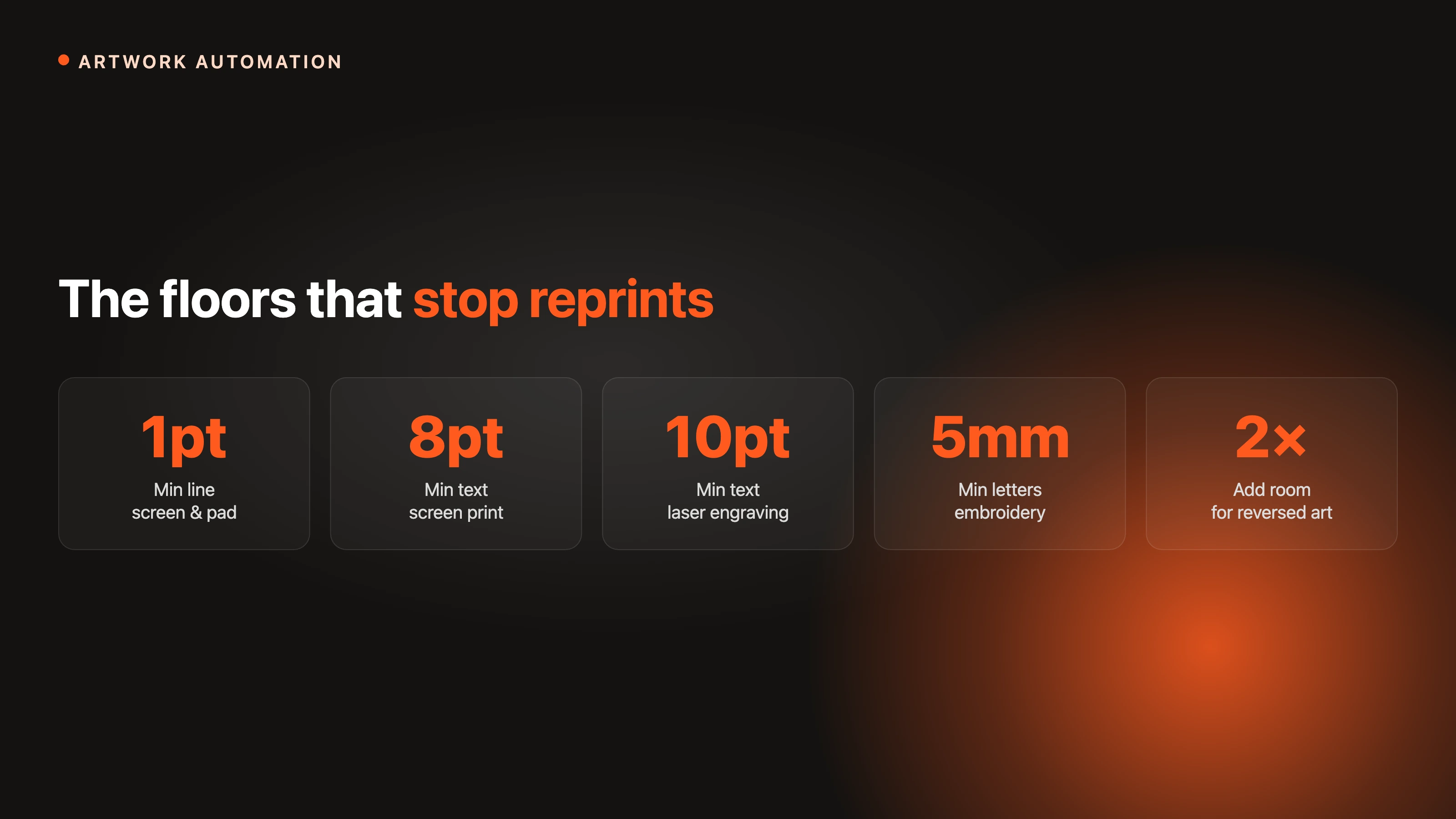
For clean output, keep lines at or above 1 pt and text at or above 8 pt for screen and pad printing, 10 pt text for laser engraving, and 5 mm letter height for embroidery. Reversed art needs more room. Preflight every file against these limits, ideally automatically, to stop reprints.
The short version: for most pad and screen decoration, keep lines at or above 1 pt and text at or above 8 pt; for laser engraving, 10 pt text and 1 pt lines; for embroidery, a 5 mm letter height. Reversed art needs more room, and an automated line-thickness check can flag any stroke below the method minimum before the file reaches production.
Most reprints do not come from a press failure. They come from artwork that was never going to hold at production size: a hairline rule that vanishes, 6 pt text that fills in, a reversed logo whose gaps close up. The fix is reliable and unglamorous: know the minimum line weight, also called stroke width, and the minimum font size for each decoration method, and check every file against those limits before it goes near a machine.
This guide collects the working minimums used across screen printing, transfers, laser engraving, and embroidery, then shows how to enforce them automatically. FastEditor runs these checks at upload, but the numbers are useful whether you automate them or eyeball them.
Every decoration method has a physical floor. Screen printing pushes ink through a mesh, so a line thinner than the mesh can hold simply breaks up. Laser engraving burns a channel that has width and depth, so fine strokes lose definition. Embroidery lays thread with real thickness, so small letters turn into knots. What looks crisp at 400% on a monitor is not what the machine can resolve on a mug, a pen, or a polo.
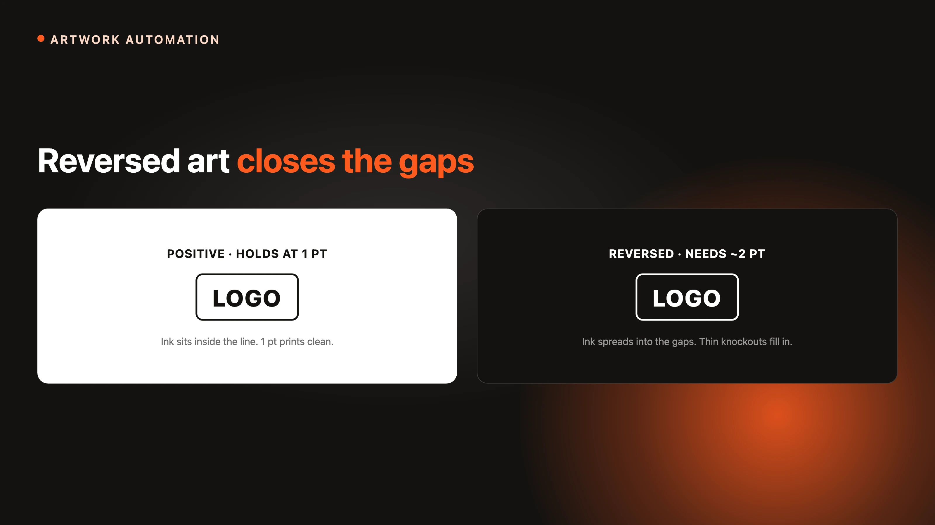
Reversed, or knockout, artwork makes it worse. When the design is the negative space, ink spread closes the gaps, so the same line that prints fine in positive disappears in reverse. That is why nearly every decorator asks for larger minimums on knockout work.

What the machine sees: the same logo below and at the screen-print minimums.
The table below shows widely used production minimums. Treat them as floors, not targets. The closer you sit to a limit, the more the substrate, colour, and run length decide whether it holds.
| Method | Minimum line / stroke | Minimum text | Notes |
|---|---|---|---|
| Screen printing | 1 pt (about 0.35 mm); 2 pt reversed | 8 pt | Halftones up to about 55 LPI |
| DTG (direct to garment) | About 0.5 to 1 pt | 6 pt, bold | 300 dpi CMYK; white underbase thickens fine detail |
| DTF / heat transfer | 0.014 in (about 1 pt); 0.028 in knockout space | Bold sans for small text | 300 dpi artwork |
| Sublimation | About 0.5 pt | 6 pt | Polyester only; full bleed, 300 dpi |
| Pad printing | About 1 pt (fine detail to ~0.2 mm) | 6 to 8 pt | Small print area; bolder strokes for reversed |
| Laser engraving | 1 pt | 10 pt | Solid black and white only, no greys |
| Embroidery | Stitch length at least 1 mm | 5 mm letter height (about 0.2 in); 8 mm safer | All caps and block fonts for small lettering |
| UV printing | About 0.5 to 1 pt | 6 pt | White underbase; doming distorts edges, avoid hairlines |
| Fine offset / labels | 0.25 pt absolute floor | 4 pt | Tints below 10% drop out, above 90% fill in |
These align with published guidelines from decorators and trade printers: a 1 pt line and 8 pt minimum from Oregon Screen Impressions, a 10 pt text and 1 pt line floor in laser engraving requirements, a 0.014 in stroke minimum from DTF transfer guidelines, and a roughly 5 mm embroidery letter-height floor noted by embroidery shops. The minimums for DTG, sublimation, pad, and UV printing vary more by machine and operator, so treat those rows as typical floors and confirm with your supplier.
Specs arrive in mixed units, so a 0.3 mm screen-print minimum and a 1 pt rule are easy to confuse. One point equals one seventy-second of an inch, or about 0.353 mm. The common floors convert as follows.
| Points | Millimetres | Inches |
|---|---|---|
| 0.25 pt | 0.09 mm | 0.0035 in |
| 0.5 pt | 0.18 mm | 0.007 in |
| 1 pt | 0.35 mm | 0.014 in |
| 2 pt | 0.71 mm | 0.028 in |
| 3 pt | 1.06 mm | 0.042 in |
For screen printing, keep positive lines at or above 1 pt (about 0.35 mm) and text at or above 8 pt. Reversed lines should be doubled to about 2 pt because ink spread closes the gaps. Halftones hold up to roughly 55 LPI on most garment work; finer screens start to plug. Direct-to-film and other heat transfers behave similarly: keep strokes at about 0.014 in (roughly 1 pt) and leave at least 0.028 in (about 2 pt) of knockout space, with artwork built at 300 dpi at final size. This is also why a screenshot-quality logo needs rebuilding before it can be trusted; see fixing low-quality customer logos.
Laser engraving wants solid black and white art with no greys or tints, text at or above 10 pt, and lines at or above 1 pt; a 0.25 pt hairline will not reproduce. Registration marks matter here too: a trademark or registered symbol should be no smaller than about 0.031 in (0.79 mm) and carry a real stroke, not a hairline. Pad printing can hold fine detail, but it is still bound by a practical floor near 1 pt, and small reversed detail needs bolder strokes to survive the transfer. Match the limit to the method, because the same logo can be legal for pad printing and illegal for embroidery on the next line of the same order. For a refresher on how the methods differ, see decoration techniques explained.
Thread has real thickness, so embroidery has the largest minimums. Keep letter height at about 5 mm (0.2 in) as a floor and 8 mm where you can, use all caps and simple block fonts for anything small, and keep stitch length at or above 1 mm so stitches do not pile up and tear the fabric. Fine lines and tiny serifs do not simplify cleanly, they distort, which is why digitizing has to respect these limits up front. This is exactly the kind of constraint automated embroidery digitizing is built to enforce, and it ties into choosing the right file format for embroidery.
Whenever the artwork is the negative space, add a point or two to every minimum. A 1 pt positive line becomes about 2 pt in reverse; 8 pt positive text is safer at 10 to 12 pt knocked out. The reason is consistent across methods: ink, thread, or engraved edges spread into the gaps, so the thinner the gap, the more likely it closes. If a design only works in reverse at small size, it is usually a sign the logo needs a positive-space variant for small decoration areas.
When a file sits below the floor, the fixes are mechanical and quick to apply in any vector application.
A real example: a 0.3 pt keyline around a logo passed the on-screen proof, then dropped out across a 500-unit screen-print run. Rebuilt at 1 pt, the reprint held. The automated check that would have flagged it runs in milliseconds, before the file ever reaches the press.
Manual checking does not survive volume. One careful operator can eyeball a handful of files a day; nobody can eyeball two thousand. The durable fix is to encode the minimums and run them on every file at upload. In FastEditor that happens in three layers. A line-thickness check flags any stroke below the method minimum before the file moves on. Automated vectorization rebuilds raster logos into clean vector paths, so strokes have real, measurable width instead of fuzzy pixels. And the rules can be set per decoration method and per SKU, which matters when one product carries different limits on each print option, the exact pain that shows up when teams try to standardise print data across a supplier catalogue. The result is that a file either passes the limits or gets caught at the door, not at the press.
Prefer it on paper? Download the one-page preflight checklist (PDF), with the minimums, the point-to-millimetre conversions, and the full pre-production checklist on a single page.
About 1 pt (0.35 mm) for positive lines and about 2 pt for reversed lines, because ink spread closes thin gaps in knockout art.
Roughly 8 pt for screen printing, 10 pt for laser engraving, and a 5 mm letter height for embroidery. Reversed text needs a couple of points more.
About a 5 mm letter height (roughly 0.2 in) as a floor, with 8 mm safer. Use all caps and simple block fonts for the smallest lettering so stitches do not collapse.
About 1 pt, in solid black and white with no greys. A 0.25 pt hairline will not reproduce because the beam has a real width.
A practical floor near 1 pt (fine detail to roughly 0.2 mm), with bolder strokes for reversed detail because the print area is small and the pad transfer spreads ink slightly.
One point equals one seventy-second of an inch, or about 0.353 mm. So 0.25 pt is about 0.09 mm, 1 pt is about 0.35 mm, and 2 pt is about 0.71 mm.
Screens have effectively unlimited resolution; decoration methods have a physical floor set by mesh, thread, or laser width. A line that looks crisp zoomed in can still sit below that floor at true size.
Automate it. Encode the minimums per decoration method and per SKU and run the check on every file at upload, so violations are caught before they reach the machine.