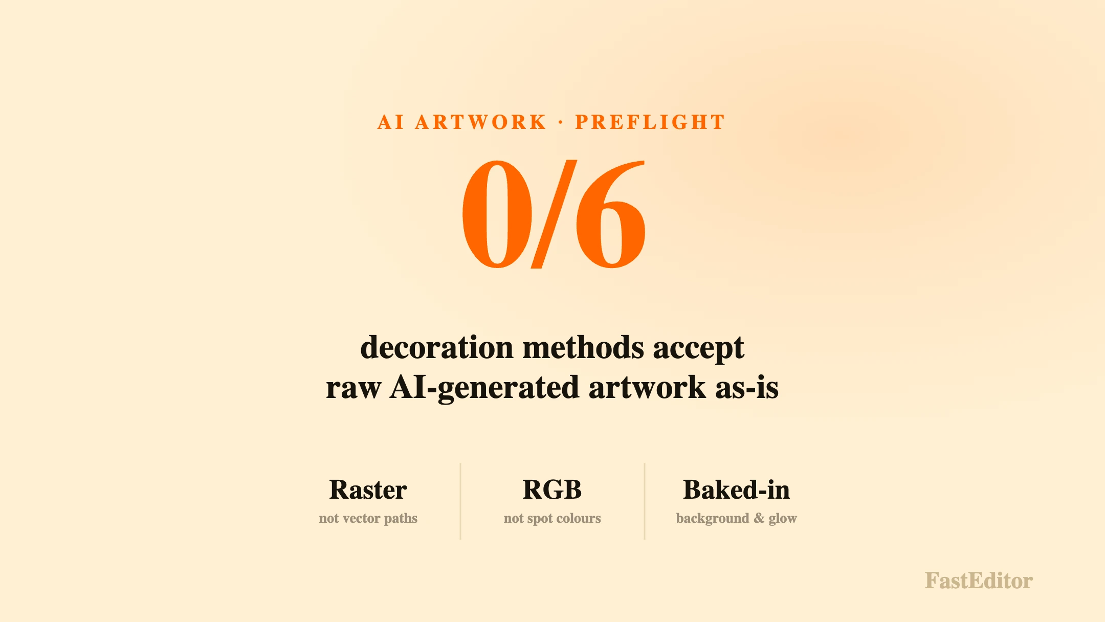
AI-generated artwork is RGB raster with baked-in backgrounds, soft gradients and no separable spot colours, so it looks print-ready on screen but fails screen print, pad print, laser engraving and embroidery. Automation bridges the gap by vectorizing, colour-matching and preflighting the AI output into a production-ready file before it reaches the machine.
A customer opens your editor, types a prompt into an AI image generator, and ten seconds later a striking logo appears: a fox's head in a golden gradient, crisp edges, a soft glow behind it. On screen it looks finished. They approve it, pay, and the order drops into your queue for screen printing on 250 tote bags. That is where it stops looking finished. The file is a 1024 by 1024 pixel PNG in RGB, the fox is built from thousands of soft-edged pixels rather than paths, the gradient cannot be split into inks, and the glow hides a background that is not actually transparent. None of that was visible in the preview.
Generative AI has made it trivial to produce artwork that looks ready. What it has not changed is what a press, an engraver or an embroidery machine physically needs. This article explains why AI-generated artwork rarely arrives production-ready, what breaks per decoration method, and how FastEditor turns that output into a file that runs first time. It is the same gap that separates an on-screen preview from a production file.
On this page
A screen and a printer are two different machines with two different rulebooks. Screens are additive and native to RGB: they emit red, green and blue light, and they render millions of pixels, soft gradients and glowing edges effortlessly. AI image generators are built to please that screen. They output a dense grid of RGB pixels, and at a comfortable viewing size the result can look sharper and more polished than most logos a customer would otherwise upload.
Production equipment plays by the opposite rules. Presses lay down a fixed set of inks, engravers cut a single colour, and embroidery machines stitch discrete thread colours. The qualities that make AI output look good on a display, continuous colour, feathered edges and photographic detail, are exactly the qualities those machines cannot reproduce. The colour side of that mismatch is covered in depth in RGB vs CMYK vs Pantone.
The failures are consistent, and they are structural rather than cosmetic. You cannot fix them by asking the generator for a higher resolution.
AI generators produce raster images: fixed grids of pixels. Screen printing, pad printing and laser engraving all need vector paths, which describe shapes mathematically so they scale to any size and separate cleanly into colours. A raster fox enlarged to fit a print area blurs and pixelates, because the pixels are simply stretched. There is no path to cut, screen or engrave. Converting one to the other is a real process, not a save-as, and it is explained in how automated vectorization works.
An AI logo might contain hundreds of subtly different orange pixels blending into one another. Screen printing needs that reduced to a small number of named spot colours, each on its own screen. Pad printing and engraving are stricter still. Sending RGB straight to production shifts and dulls the colour, which is why commercial print is held to standards such as the Ghent Workgroup PDF/X specifications and the ISO 12647 series. Matching a customer's colours to a printable palette is its own discipline, described in PMS colour matching for promo products.
The gradient that makes an AI logo look premium is often the single biggest obstacle to decorating it. Screen print, pad print and embroidery reproduce flat, defined areas of colour, not smooth blends or drop shadows. A glow behind a mark becomes a muddy halo or a hard-edged blob once it is separated. What looks like a design feature on screen is, to a decoration method, an instruction the machine cannot follow.
AI output frequently arrives with a background baked in, a white square or a textured scene that will print as a visible rectangle unless it is removed. On top of that, generators love fine ornament: hairline strokes, tiny serifs, delicate filigree. Every decoration method has a minimum line thickness and detail size below which strokes fill in or disappear entirely, and AI art routinely sits under it. Those thresholds, and why they cause reprints, are set out in minimum line thickness and font size for print, and enforcing them automatically is the job of automated line thickness checks.
When an AI image includes words, they are not set in a font. They are pixels shaped to resemble letters, often subtly malformed, and they cannot be re-kerned, recoloured or outlined the way real type can. For a promotional product where the brand name has to be exact, drawn-on lettering is a liability, not an asset.
A JPEG that looks fine on a product page can sail through e-commerce untouched. Promotional decoration has no such tolerance, because it is not one process but six, each with its own physics. Screen printing, pad printing, laser engraving, digital print, sublimation and embroidery each demand a different file type, colour model and level of detail. A file that is perfect for direct-to-garment printing is useless for engraving, and a stitch file for embroidery bears no resemblance to either. The differences between the methods, and what each can physically reproduce, are laid out in decoration techniques explained.
Raw AI output is RGB raster with a background and soft colour. Here is how that collides with what each common method actually requires.
| Decoration method | What it needs | Why raw AI output fails |
|---|---|---|
| Screen printing | Vector, separated spot colours | Raster with unseparable RGB gradients |
| Pad printing | Vector, spot colours, fine detail held | Soft edges and sub-minimum strokes collapse |
| Laser engraving | Single-colour vector paths | No paths, no single-colour version |
| DTG / DTF | 300 DPI CMYK, transparent background | Low effective DPI, RGB, baked-in background |
| Sublimation | 300 DPI CMYK, template aligned, full bleed | RGB, wrong dimensions, no bleed |
| Embroidery | Digitised stitch file, flat thread colours | Gradients and photographic detail cannot be stitched |
The problem is not that AI art is bad. It is that AI generates the wrong kind of file for the job, and no amount of prompting changes that. The fix is to treat AI output as an input to an automated pipeline rather than a finished asset. Instead of inspecting the file and emailing the customer for corrections, the system generates a compliant file from whatever arrived: it vectorizes the raster mark, removes the background, reduces and matches the colours to printable spot values, checks detail against the receiving supplier's minimums, and outputs a production-ready file through production-ready file generation.
The scale of the underlying problem is measurable. Across 13,773 logo uploads analysed in the FastEditor 2026 benchmark, roughly 85 percent needed at least one automated fix before they were production-ready, 61 percent needed vectorization, and 79 percent needed upscaling. AI-generated art fails on exactly those axes, raster structure and insufficient real resolution, so it lands squarely in the majority that automation has to repair. The generated output runs at 99.95 percent file accuracy against the specifications FastEditor maintains for more than 150 suppliers.
None of this means keeping AI out of the editor. Customers like generating artwork, and it lifts conversion. It means never letting raw AI output reach a machine. Let customers create freely, then pass every result through automation before it is decorated, and show them a real print proof that simulates the actual decoration method, so approval means approving what will be produced rather than what looks good on a screen. Genuinely unprocessable inputs, such as a photographic scene submitted as a logo, should be flagged for human review, the same way any low-quality upload is. For a wider view of where AI genuinely helps the promo industry and where it is overstated, see what PPAI's data actually shows.
If AI-generated files are starting to appear in your order queue, the question is no longer whether customers will use these tools, but whether your workflow can turn what they make into something a machine can run. That is the gap artwork automation closes. You can see what enforcing it against your own order volumes would look like on the FastEditor pricing page, which starts with a free consultation.
Usually not. Most AI output is RGB raster with a baked-in background and soft colour, which fails the vector, spot-colour and transparency requirements of screen print, pad print, engraving and embroidery. It needs to be vectorized, colour-matched and preflighted first.
Because it is raster. The pixels look crisp at screen size, but enlarging them to a print area stretches the same pixels, so edges blur and fine detail breaks up. Only a vector version scales cleanly to production size.
In most cases, yes. Automated vectorization traces the mark into paths, reduces the colours to a printable set and removes the background. Clean, high-contrast AI logos convert well; busy photographic images are flagged for review instead.
Only after it is simplified and digitised. Embroidery stitches flat thread colours and cannot reproduce gradients, glows or photographic detail, so an AI image has to be reduced to a small number of solid colours and converted into a stitch file before it can be sewn.
More articles in Artwork Automation.
